Oska Health
Role
Head of Product Experience Design
Year
2024-2025
Oska Health is an AI-assisted preventative care platform for people living with chronic conditions such as kidney disease, diabetes and hypertension. Health insurers fund the programme — more than twenty statutory insurers in Germany — patients use it free of charge, and qualified health coaches deliver care through a mobile app. As a certified medical device, every design decision required a documented risk assessment before shipping. I joined Oska during the product-market fit exploration.
Designing for trust and conversation
+20% call bookings
€11M seed round
View Live Site→
The Challenge
Key interaction of the platform: a patient booking and taking their first call with a health coach. Booking rates for that first call were well below what the care model needed. This means no revenue for the business, and no care for the people with chronic diseases.
Outcome
+20% call-booking conversion €11M seed round led by Capricorn Partners and SwissHealth Ventures (February 2026) Expansion with more insurer and physician networks now underway.
My Role
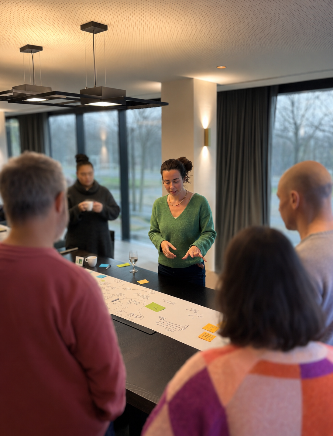
I owned design strategy, discovery research, and end-to-end UX across all platforms (the patient app, coach platform, website, and insurer touchpoints). I influenced product vision, roadmap, feature scope, and marketing decisions. My team: one product designer, one visual designer, one copywriter, and ad-hoc freelancers. I worked in close collaboration with the founders, a behavioural scientist, health coaches, product, and engineering.
The Approach
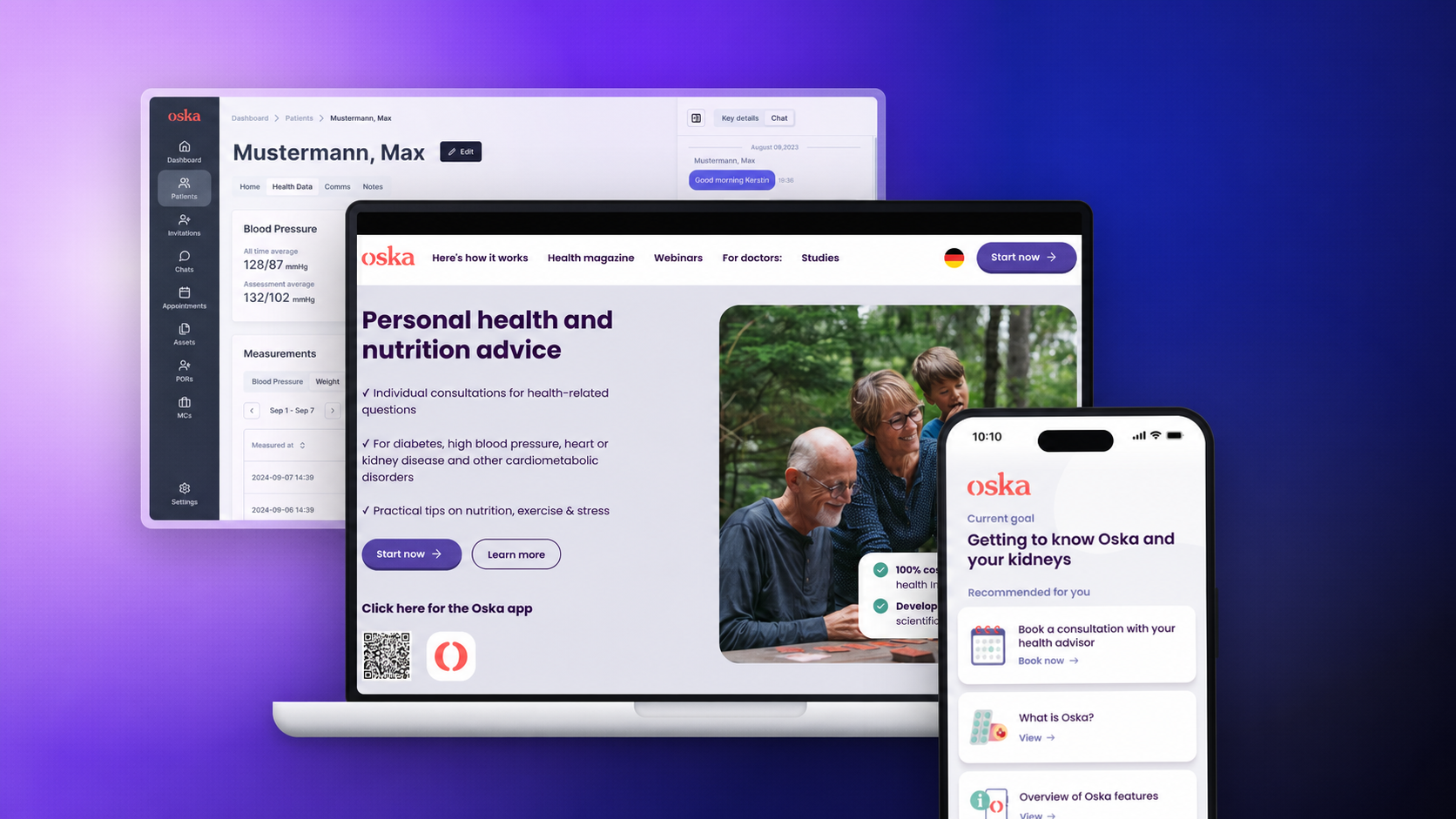
I started with discovery research across existing users, health coaches, and users that didn't convert. The research showed the problem didn't start in the app. People arrived sceptical — newly diagnosed, emotionally low, unsure whether Oska was credible or even free. As one user put it: “If I hadn't received the official recommendation letter from my health insurance, I would never have installed it.”
Trust was the design problem. And it had to be built across the whole service. In three layers — the patient experience, the value proposition upstream of the app, and the tools coaches used to deliver care.
Layer I : The Patient App
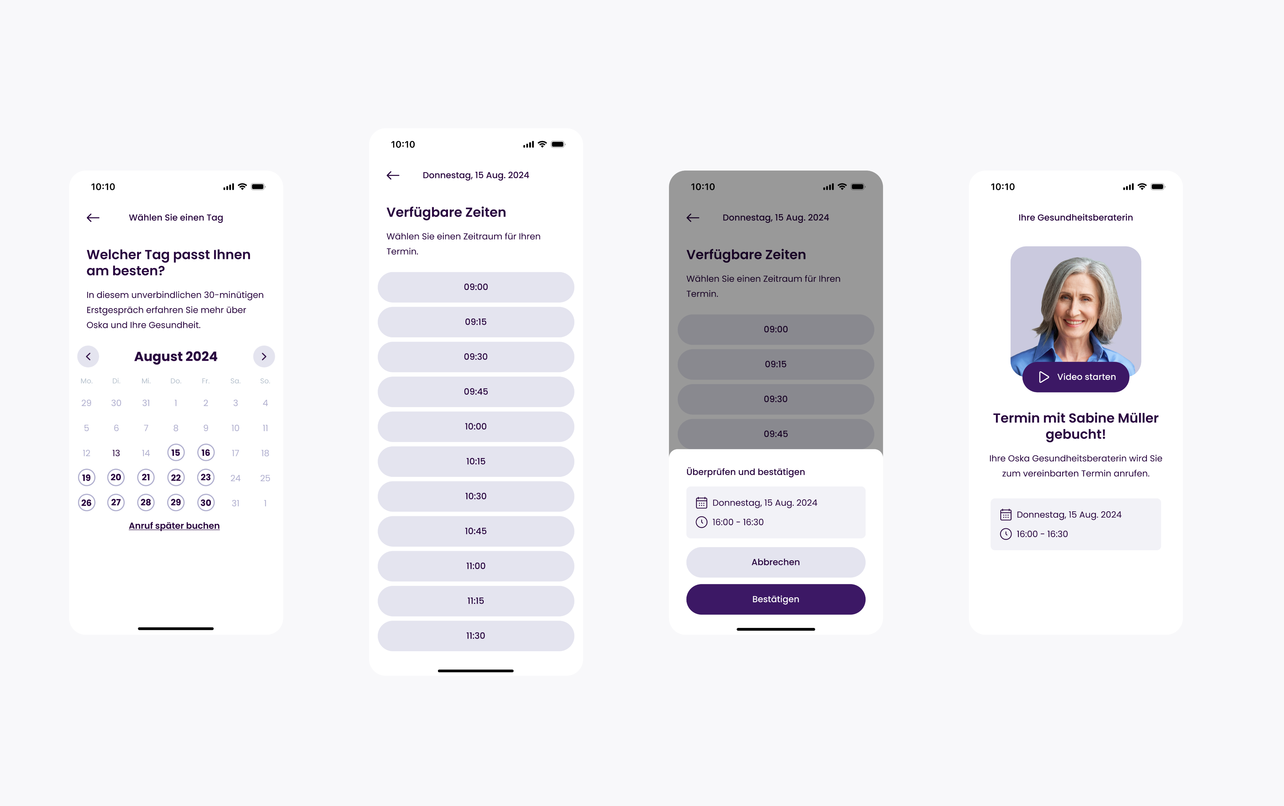
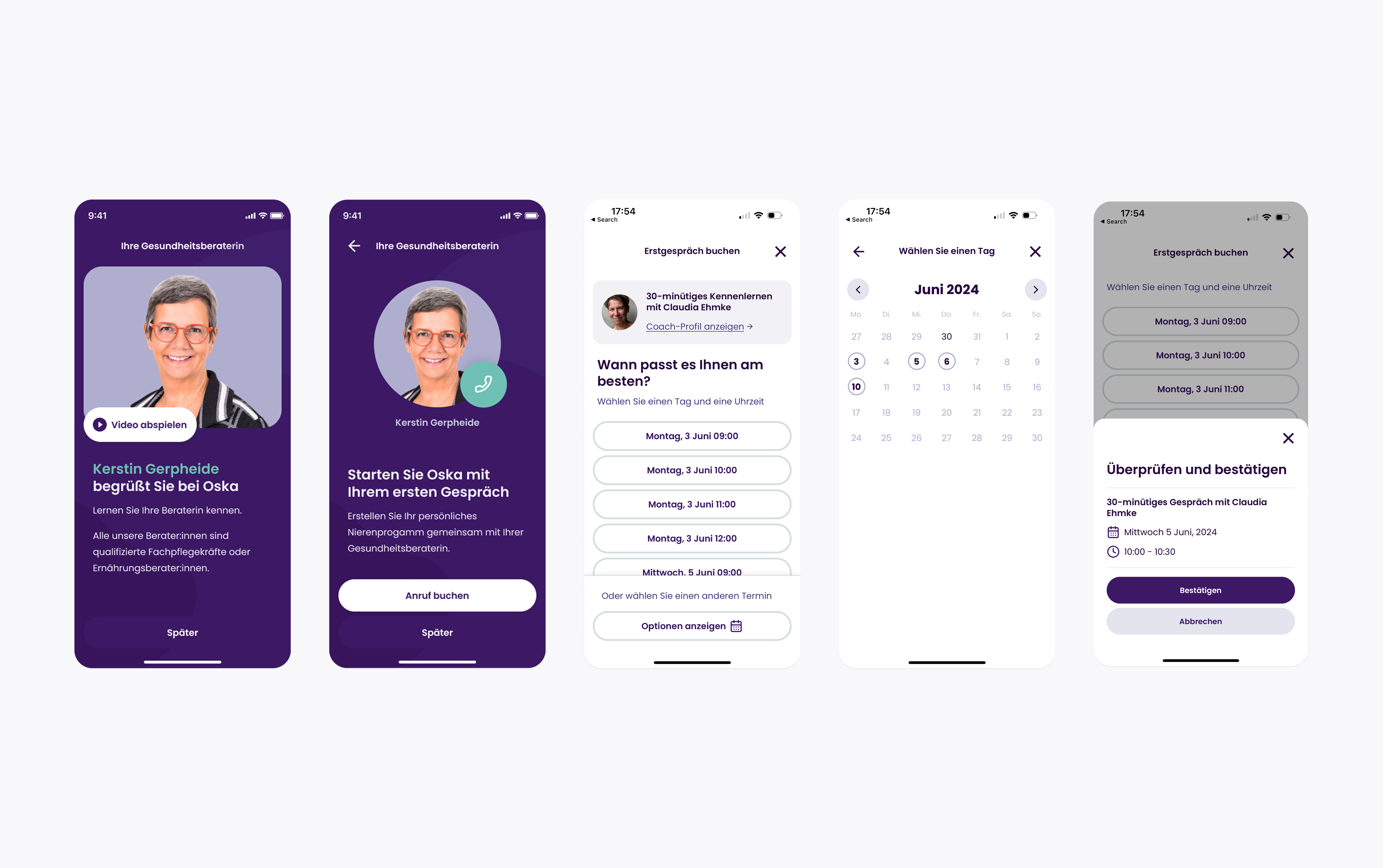
The biggest single win came from sequencing the call booking flow. The original flow showed patients their assigned coach before they'd committed to a time — hypothesis: showing the coach too early added doubt about whether this particular person could help, and limited available slots to one coach's calendar. I moved the coach screens to after booking, alongside other quick fixes in the call booking flow: a “meet your coach” loader, clearer coach information, and cutting onboarding steps from 14 to 7.
The A/B test validated it: call-booking conversion rose by twenty points.
Layer II: Website & Insurer touchpoints
Layer 2 — The app's conversion improved, but the overall number stayed below target. Something upstream was broken. A fast-turnaround website relaunch was built without user testing of the final version, at the same time as the app redesign.
Guerrilla testing with friends and family of Oska employees gave us a same-day signal: the relaunched website wasn't building trust. Within three days we had five website and and five insurer letter versions tested with 23 people in doctor practices; over two months, more than 60 interviews. We rebuilt on one principle: every Oska interface had to live up to the credibility the insurer had already established. We rewrote insurer letters, built co-branded landing pages, and created activation flows. Upstream conversion recovered — and settled well above its previous benchmark.
Three layers of design work that turned a struggling booking metric into part of the growth story behind Oska's €11M next stage.
Here’s what people are saying

Claudia Ehmke
Co-founder, CPO Oska Health
What makes Pelin exceptional is her ability to hold both vision and execution.


Niklas Best
Co-founder, CEO of Oska Health
Pelin cuts through complexity, collaborates across teams, and moves fast with intention that creates a lasting difference.
Next project
Google Payments
→
Oska Health
Role
Head of Product Experience Design
Year
2024-2025
Oska Health is an AI-assisted preventative care platform for people living with chronic conditions such as kidney disease, diabetes and hypertension. Health insurers fund the programme — more than twenty statutory insurers in Germany — patients use it free of charge, and qualified health coaches deliver care through a mobile app. As a certified medical device, every design decision required a documented risk assessment before shipping. I joined Oska during the product-market fit exploration.
Designing for trust and conversation
+20% call bookings
€11M seed round
The Challenge
Key interaction of the platform: a patient booking and taking their first call with a health coach. Booking rates for that first call were well below what the care model needed. This means no revenue for the business, and no care for the people with chronic diseases.
Outcome
+20% call-booking conversion €11M seed round led by Capricorn Partners and SwissHealth Ventures (February 2026) Expansion with more insurer and physician networks now underway.
My Role
I owned design strategy, discovery research, and end-to-end UX across all platforms (the patient app, coach platform, website, and insurer touchpoints). I influenced product vision, roadmap, feature scope, and marketing decisions. My team: one product designer, one visual designer, one copywriter, and ad-hoc freelancers. I worked in close collaboration with the founders, a behavioural scientist, health coaches, product, and engineering.
The Approach
I started with discovery research across existing users, health coaches, and users that didn't convert. The research showed the problem didn't start in the app. People arrived sceptical — newly diagnosed, emotionally low, unsure whether Oska was credible or even free. As one user put it: “If I hadn't received the official recommendation letter from my health insurance, I would never have installed it.”
Trust was the design problem. And it had to be built across the whole service. In three layers — the patient experience, the value proposition upstream of the app, and the tools coaches used to deliver care.
Layer I : The Patient App
The biggest single win came from sequencing the call booking flow. The original flow showed patients their assigned coach before they'd committed to a time — hypothesis: showing the coach too early added doubt about whether this particular person could help, and limited available slots to one coach's calendar. I moved the coach screens to after booking, alongside other quick fixes in the call booking flow: a “meet your coach” loader, clearer coach information, and cutting onboarding steps from 14 to 7.
The A/B test validated it: call-booking conversion rose by twenty points.
Layer II: Website & Insurer touchpoints
Layer 2 — The app's conversion improved, but the overall number stayed below target. Something upstream was broken. A fast-turnaround website relaunch was built without user testing of the final version, at the same time as the app redesign.
Guerrilla testing with friends and family of Oska employees gave us a same-day signal: the relaunched website wasn't building trust. Within three days we had five website and and five insurer letter versions tested with 23 people in doctor practices; over two months, more than 60 interviews. We rebuilt on one principle: every Oska interface had to live up to the credibility the insurer had already established. We rewrote insurer letters, built co-branded landing pages, and created activation flows. Upstream conversion recovered — and settled well above its previous benchmark.
Three layers of design work that turned a struggling booking metric into part of the growth story behind Oska's €11M next stage.
Here’s what people are saying
Claudia Ehmke
Co-founder, CPO Oska Health
What makes Pelin exceptional is her ability to hold both vision and execution.
Niklas Best
Co-founder, CEO of Oska Health
Pelin cuts through complexity, collaborates across teams, and moves fast with intention that creates a lasting difference.
Next project
Google Payments
→
Oska Health
Role
Head of Product Experience Design
Year
2024-2025
Oska Health is an AI-assisted preventative care platform for people living with chronic conditions such as kidney disease, diabetes and hypertension. Health insurers fund the programme — more than twenty statutory insurers in Germany — patients use it free of charge, and qualified health coaches deliver care through a mobile app. As a certified medical device, every design decision required a documented risk assessment before shipping. I joined Oska during the product-market fit exploration.
Designing for trust and conversation
+20% call bookings
€11M seed round
The Challenge
Key interaction of the platform: a patient booking and taking their first call with a health coach. Booking rates for that first call were well below what the care model needed. This means no revenue for the business, and no care for the people with chronic diseases.
Outcome
+20% call-booking conversion €11M seed round led by Capricorn Partners and SwissHealth Ventures (February 2026) Expansion with more insurer and physician networks now underway.
My Role
I owned design strategy, discovery research, and end-to-end UX across all platforms (the patient app, coach platform, website, and insurer touchpoints). I influenced product vision, roadmap, feature scope, and marketing decisions. My team: one product designer, one visual designer, one copywriter, and ad-hoc freelancers. I worked in close collaboration with the founders, a behavioural scientist, health coaches, product, and engineering.
The Approach
I started with discovery research across existing users, health coaches, and users that didn't convert. The research showed the problem didn't start in the app. People arrived sceptical — newly diagnosed, emotionally low, unsure whether Oska was credible or even free. As one user put it: “If I hadn't received the official recommendation letter from my health insurance, I would never have installed it.”
Trust was the design problem. And it had to be built across the whole service. In three layers — the patient experience, the value proposition upstream of the app, and the tools coaches used to deliver care.
Layer I : The Patient App
The biggest single win came from sequencing the call booking flow. The original flow showed patients their assigned coach before they'd committed to a time — hypothesis: showing the coach too early added doubt about whether this particular person could help, and limited available slots to one coach's calendar. I moved the coach screens to after booking, alongside other quick fixes in the call booking flow: a “meet your coach” loader, clearer coach information, and cutting onboarding steps from 14 to 7.
The A/B test validated it: call-booking conversion rose by twenty points.
Layer II: Website & Insurer touchpoints
Layer 2 — The app's conversion improved, but the overall number stayed below target. Something upstream was broken. A fast-turnaround website relaunch was built without user testing of the final version, at the same time as the app redesign.
Guerrilla testing with friends and family of Oska employees gave us a same-day signal: the relaunched website wasn't building trust. Within three days we had five website and and five insurer letter versions tested with 23 people in doctor practices; over two months, more than 60 interviews. We rebuilt on one principle: every Oska interface had to live up to the credibility the insurer had already established. We rewrote insurer letters, built co-branded landing pages, and created activation flows. Upstream conversion recovered — and settled well above its previous benchmark.
Three layers of design work that turned a struggling booking metric into part of the growth story behind Oska's €11M next stage.
Here’s what people are saying
Claudia Ehmke
Co-founder, CPO Oska Health
What makes Pelin exceptional is her ability to hold both vision and execution.
Niklas Best
Co-founder, CEO of Oska Health
Pelin cuts through complexity, collaborates across teams, and moves fast with intention that creates a lasting difference.
Next project
Google Payments
→
Oska Health
Role
Head of Product Experience Design
Year
2024-2025
Oska Health is an AI-assisted preventative care platform for people living with chronic conditions such as kidney disease, diabetes and hypertension. Health insurers fund the programme — more than twenty statutory insurers in Germany — patients use it free of charge, and qualified health coaches deliver care through a mobile app. As a certified medical device, every design decision required a documented risk assessment before shipping. I joined Oska during the product-market fit exploration.
Designing for trust and conversation
+20% call bookings
€11M seed round
The Challenge
Key interaction of the platform: a patient booking and taking their first call with a health coach. Booking rates for that first call were well below what the care model needed. This means no revenue for the business, and no care for the people with chronic diseases.
Outcome
+20% call-booking conversion €11M seed round led by Capricorn Partners and SwissHealth Ventures (February 2026) Expansion with more insurer and physician networks now underway.
My Role
I owned design strategy, discovery research, and end-to-end UX across all platforms (the patient app, coach platform, website, and insurer touchpoints). I influenced product vision, roadmap, feature scope, and marketing decisions. My team: one product designer, one visual designer, one copywriter, and ad-hoc freelancers. I worked in close collaboration with the founders, a behavioural scientist, health coaches, product, and engineering.
The Approach
I started with discovery research across existing users, health coaches, and users that didn't convert. The research showed the problem didn't start in the app. People arrived sceptical — newly diagnosed, emotionally low, unsure whether Oska was credible or even free. As one user put it: “If I hadn't received the official recommendation letter from my health insurance, I would never have installed it.”
Trust was the design problem. And it had to be built across the whole service. In three layers — the patient experience, the value proposition upstream of the app, and the tools coaches used to deliver care.
Layer I : The Patient App
The biggest single win came from sequencing the call booking flow. The original flow showed patients their assigned coach before they'd committed to a time — hypothesis: showing the coach too early added doubt about whether this particular person could help, and limited available slots to one coach's calendar. I moved the coach screens to after booking, alongside other quick fixes in the call booking flow: a “meet your coach” loader, clearer coach information, and cutting onboarding steps from 14 to 7.
The A/B test validated it: call-booking conversion rose by twenty points.
Layer II: Website & Insurer touchpoints
Layer 2 — The app's conversion improved, but the overall number stayed below target. Something upstream was broken. A fast-turnaround website relaunch was built without user testing of the final version, at the same time as the app redesign.
Guerrilla testing with friends and family of Oska employees gave us a same-day signal: the relaunched website wasn't building trust. Within three days we had five website and and five insurer letter versions tested with 23 people in doctor practices; over two months, more than 60 interviews. We rebuilt on one principle: every Oska interface had to live up to the credibility the insurer had already established. We rewrote insurer letters, built co-branded landing pages, and created activation flows. Upstream conversion recovered — and settled well above its previous benchmark.
Three layers of design work that turned a struggling booking metric into part of the growth story behind Oska's €11M next stage.
Here’s what people are saying
Claudia Ehmke
Co-founder, CPO Oska Health
What makes Pelin exceptional is her ability to hold both vision and execution.
Niklas Best
Co-founder, CEO of Oska Health
Pelin cuts through complexity, collaborates across teams, and moves fast with intention that creates a lasting difference.
Next project
Google Payments
→